Designed Around a Pair of Le Creuset Salt and Pepper Grinders |How the right photography tells the story of a kitchen that was built to be lived in
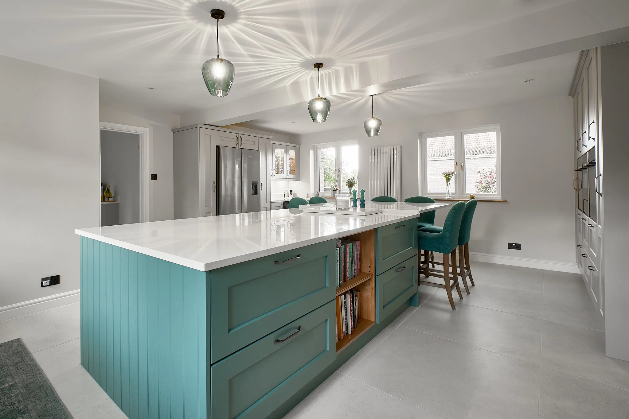
Photography: Copland Photography | Kitchen design: Vicky Elmore
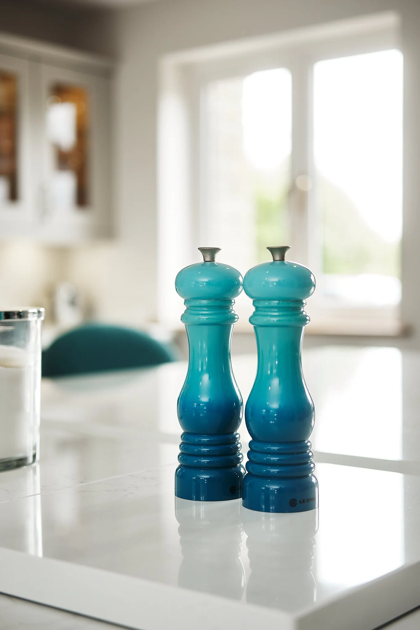
Every kitchen has a brief. Most briefs start with dimensions, cabinet styles, worktop materials. This one started with a pair of salt and pepper pots.
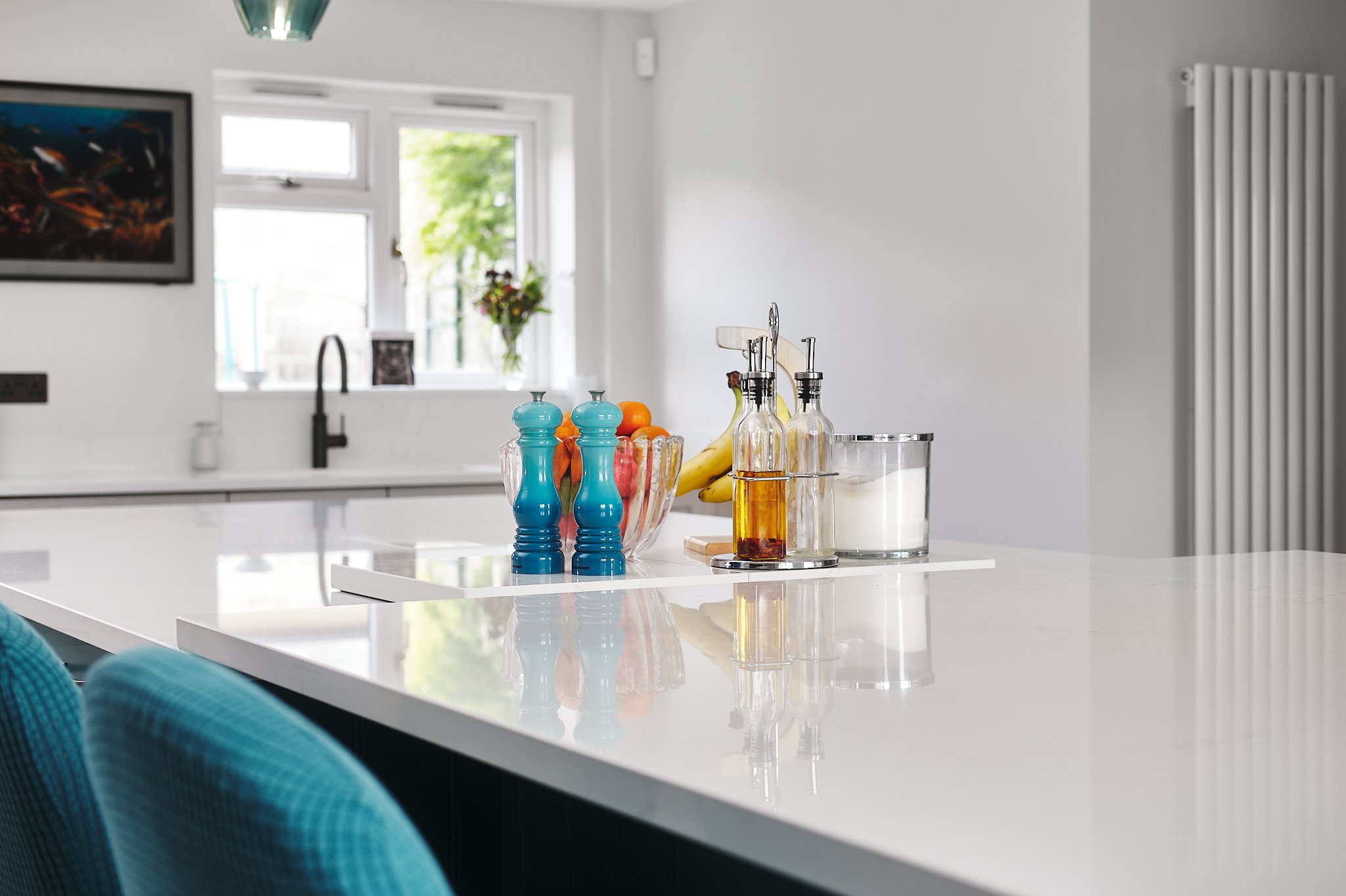
The client had a set of turquoise Le Creuset pots she loved. Vicky Elmore, the kitchen designer behind this project, built the entire colour palette outward from there, pairing the soft turquoise with a warmer neutral to keep everything feeling grounded and liveable. Country in its bones. Cleaner and more modern in its execution.
That detail tells you something important about how Vicky works. The best kitchen designers don't impose a look. They find the thread that already exists in how someone lives, and they pull it through every decision, colour, material, layout, light.
My job, when I photograph a finished project like this, is to do the same thing with the camera.
The brief
The clients wanted to knock through from the dining room into the kitchen, creating one large, open, sociable space where the whole family could cook, eat, do homework, and spend time together. The physical change was structural, but the ambition behind it was emotional: make this a room people actually want to be in.
The style brief was a woodgrain shaker in solid wood. The palette, as mentioned, was led by those Le Creuset pots, two-tone cabinetry in soft turquoise and a warmer neutral. And at the heart of it all, a generous island with seating for up to six. Not squeezed in. Not an afterthought. A dedicated seating zone at one end with its own clear space, somewhere to have a coffee, do homework, or perch with a drink while someone else cooks.
The colour palette was led by a pair of turquoise Le Creuset salt and pepper pots the client adores. I designed a two-tone scheme around that, pairing the soft turquoise with a warmer neutral to keep everything feeling grounded and liveable.
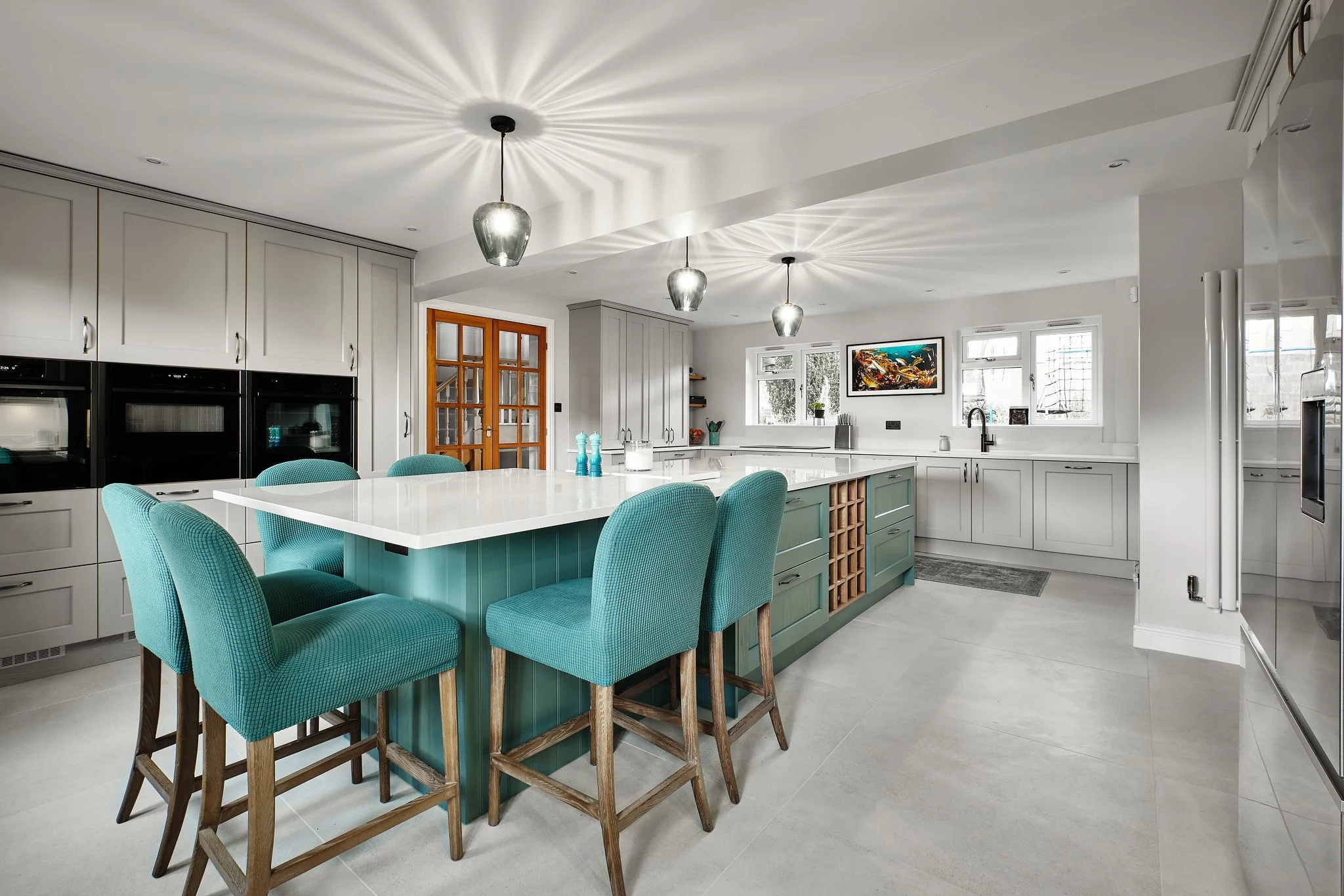
The island was designed with a dedicated seating zone — a deliberate decision to give the bar stools their own space rather than squeezing them alongside the working areas.
A kitchen designed around how people actually use it
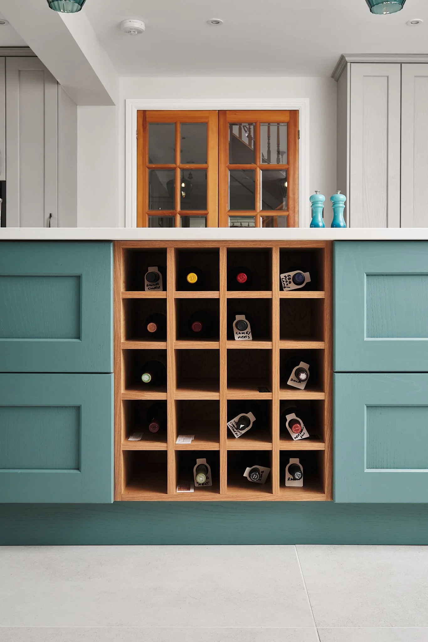
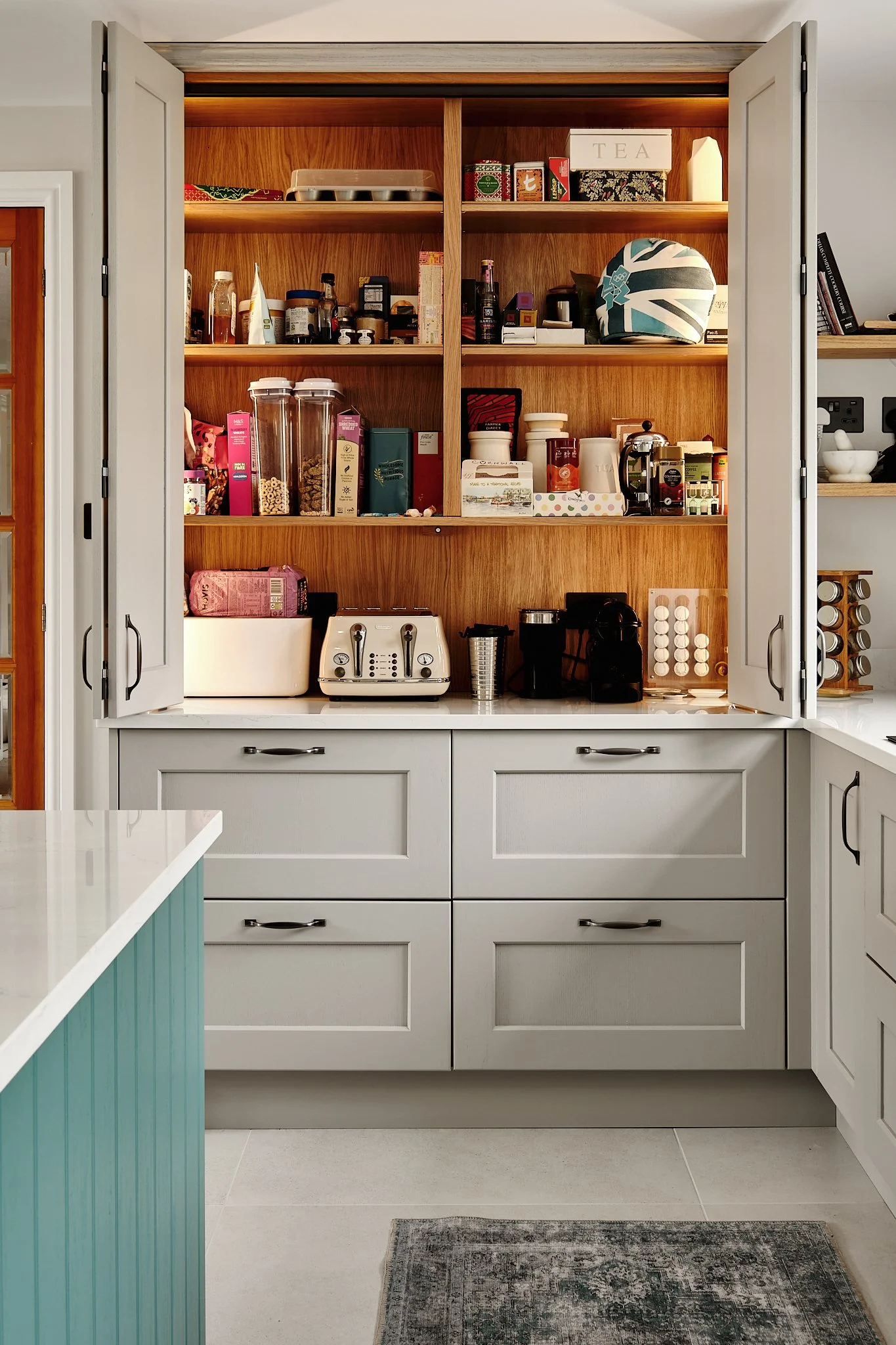
One of the things Vicky is proudest of on this project is the layout logic of the kitchen itself. Beyond the island, the room is organised into four distinct zones: cooking, prep, a wet zone around the sink, and a separate drinks area. Each one has its own clear space and its own purpose.
On paper that sounds like good planning. In a room, it feels like something else, it feels like a kitchen that makes sense. You know where to be. You know where things are. The space has a logic to it that you feel before you consciously understand it.
That's exactly what the photography needed to capture, not just how the kitchen looks, but how it works.
The photography approach
Vicky needed a mix of images that could do different jobs. Wide hero shots to establish the space and show the knock-through to the dining room. Mid-range compositions that pick out each zone and show how it sits within the whole. And close-up detail shots, the woodgrain shaker, the two-tone cabinetry, the junction between a turquoise door and a warm neutral drawer.
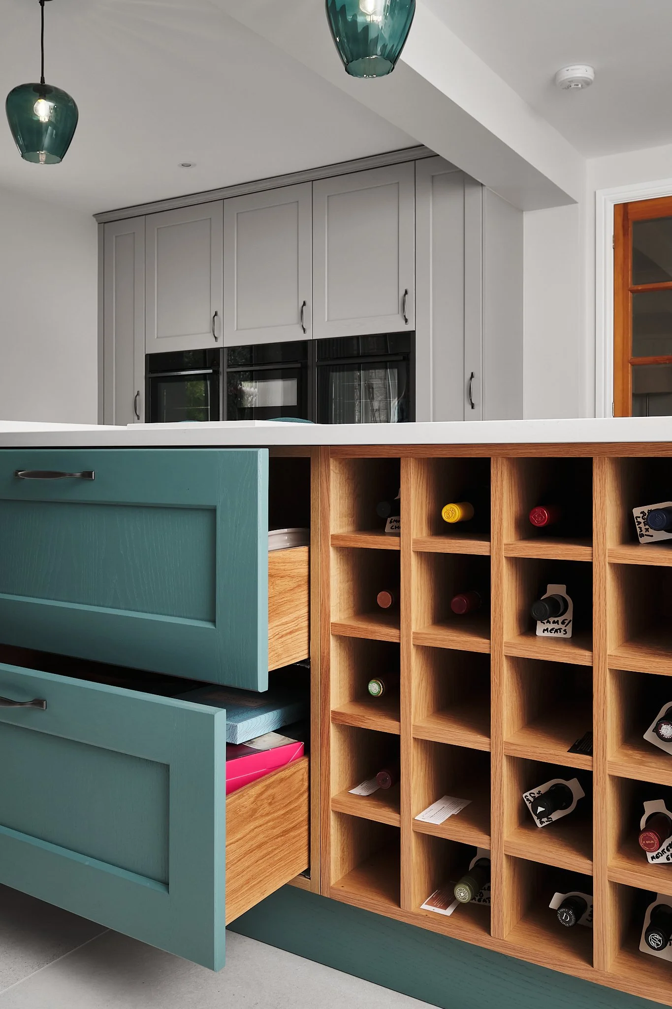
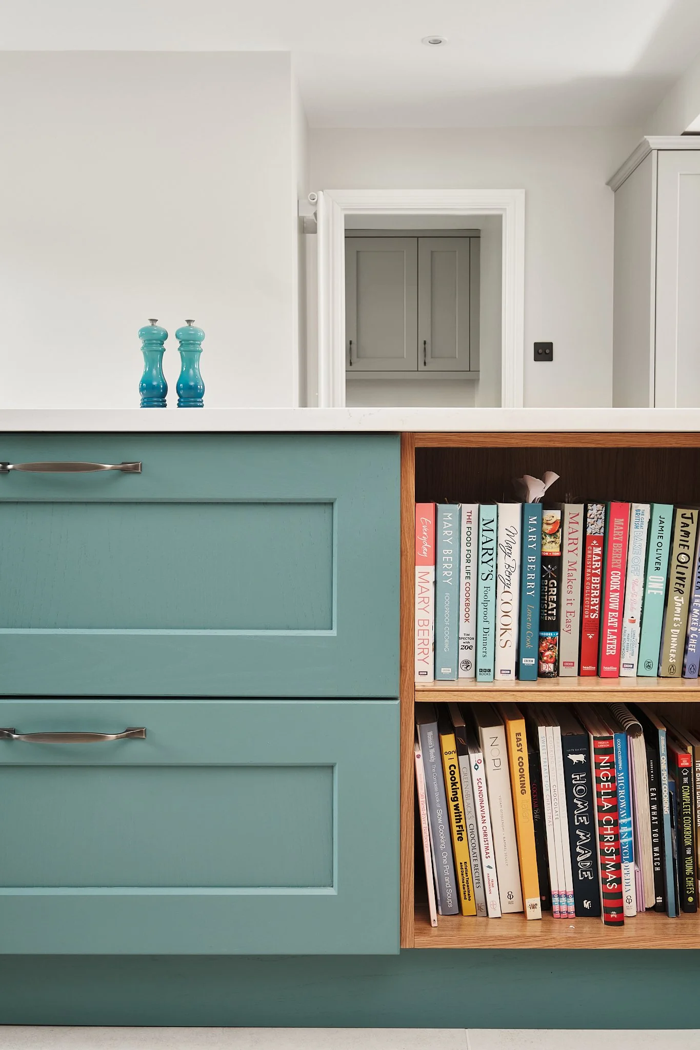
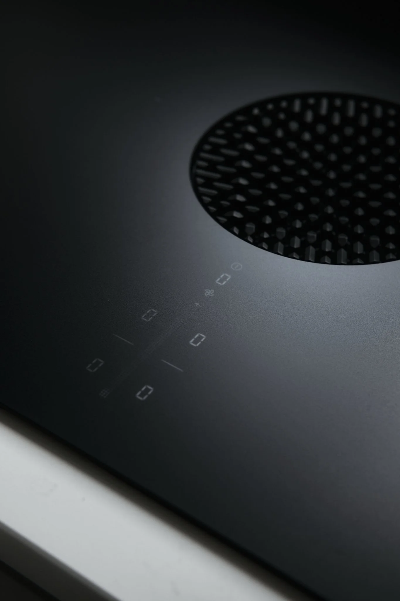
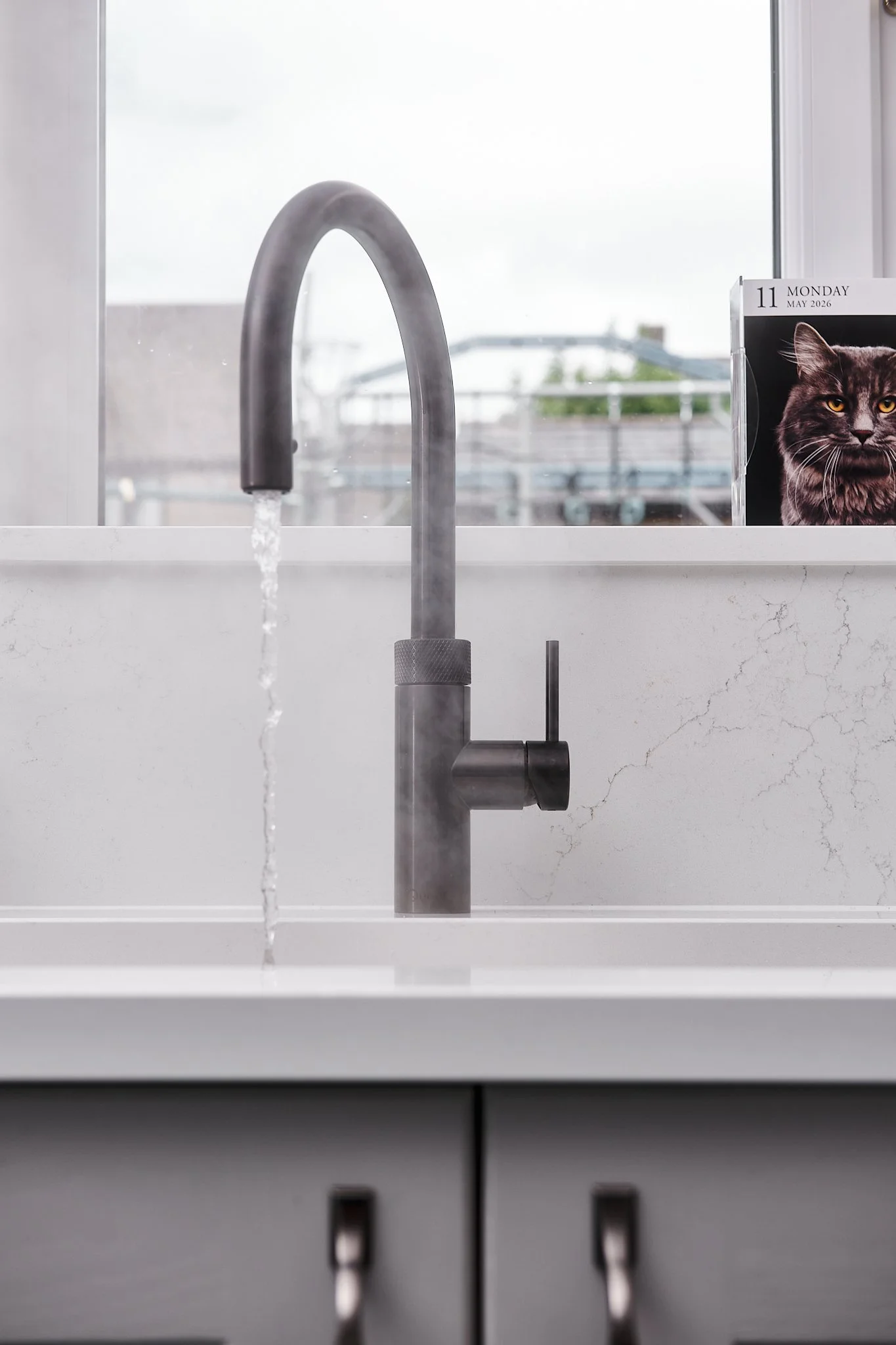
The detail shots are where the craftsmanship lives. A woodgrain shaker door up close is a very different thing from the same door in a wide shot. The texture, the solid weight of the wood, the precision of the finish, you need to get close to show that properly.
I also wanted to find the frame where both tones of the two-tone cabinetry read clearly together. The colour story only works if you can see the relationship between the turquoise and the neutral in the same image. That meant finding the right angle, close enough to show the detail, wide enough to show the contrast.
The island is the piece I'm proudest of. If the photography can pick those zones out, both in the wider shots and in some closer compositions that show how each area works, that would beautifully tell the story of how the kitchen actually functions day to day.
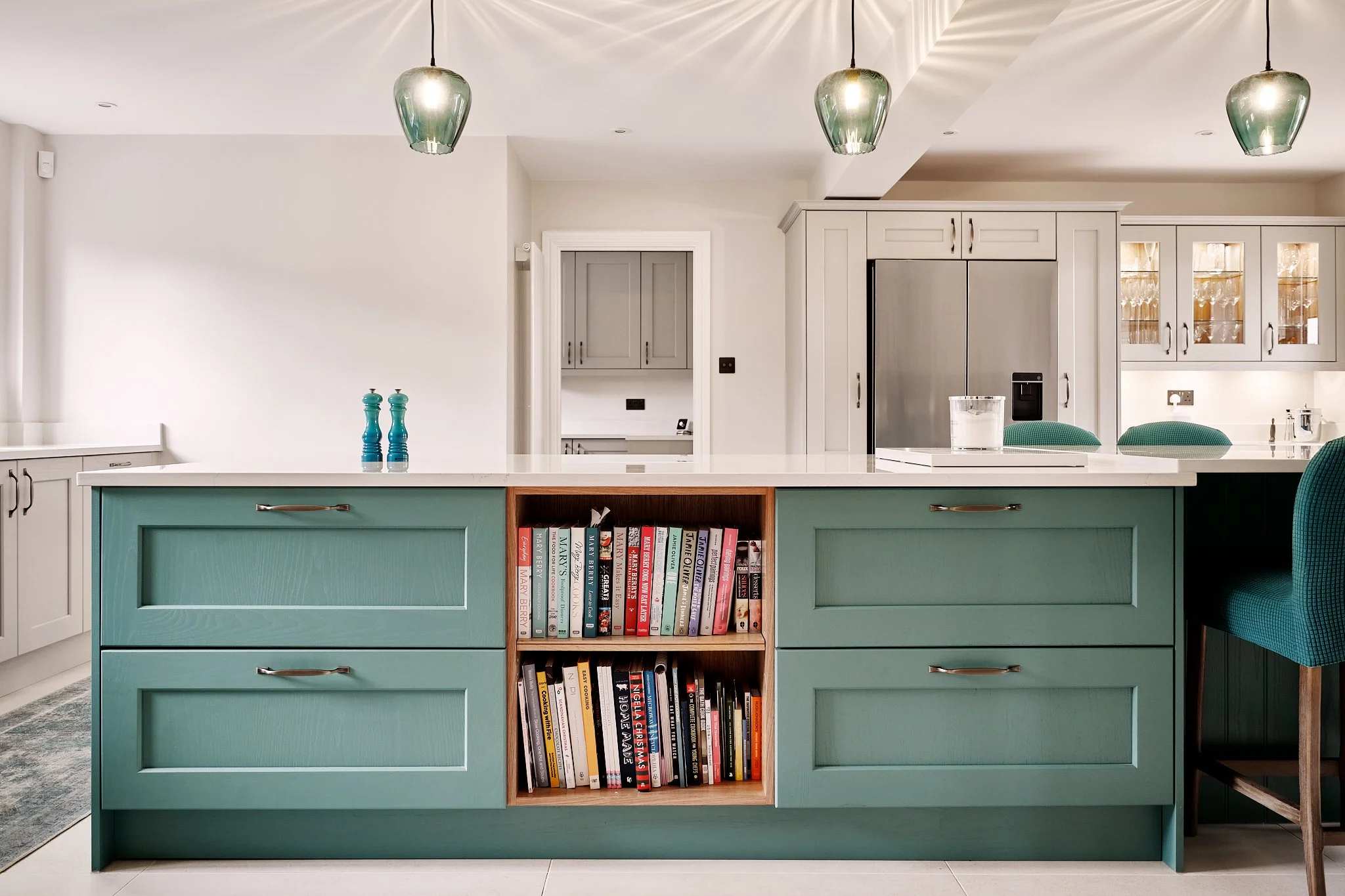
The colour palette was the client's from the start — Vicky's skill was in turning a pair of salt and pepper pots into a complete, coherent design language.
What the images are for
The finished images will go into the client gallery on Vicky's website and across her social channels, Instagram and Facebook primarily, with a selection on LinkedIn. She'll use the full set as a case study, and individual images for content over time.
That's exactly how a strong shoot should work. The hero wide shots anchor the case study and the website gallery. The zone compositions give Instagram a series of posts spread across weeks. The detail shots are the content that performs, the images people save, share, and come back to.
One shoot. Many months of content. That's the value of getting the edit right.
Why the story matters as much as the image
The Le Creuset detail could easily have been left out of any write-up of this project. It's a small thing, a pair of kitchen pots that happened to be the right colour. But it's also the thing that explains every colour decision in the room. It's the thread.
Good interior photography finds that thread and pulls it through the images. Not every shot needs to reference it explicitly. But the photographer needs to understand it, needs to know what the room is about, what it was trying to be, and what it ended up becoming, to make images that tell the whole story rather than just document a finished space.
That's what I was trying to do here.
About the photographer
Gary Copland-Powell is a commercial photographer based in Bath, specialising in interiors, hospitality, and kitchen design photography. If you're a designer or maker looking to document a finished project, get in touch at gary@coplandphotography.com or visit coplandphotography.com.
Kitchen design: Vicky Elmore